Sports + Data

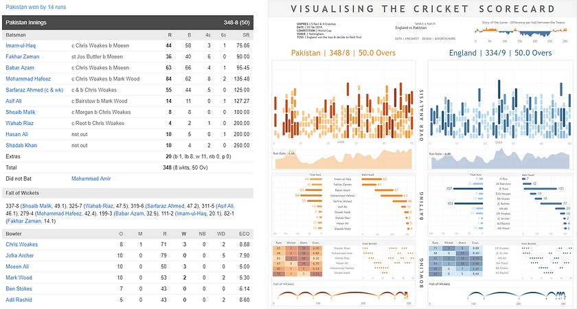
VISUALISING THE CRICKET SCORECARD
BEFORE & AFTER
The Cricket World Cup came to England in the summer of 2019.
Although I haven't shown a huge interest in cricket in the past, this seemed a good time to start paying attention - England were branded as pre-tournament favourites: Cricket could be coming home!
I therefore set out to rethink the Cricket Scorecard and how to visualise the most important elements of the game. The idea was to be able to tell the story of a particular match through a series of consistent and well presented charts. Read the story about the design process & the different elements of the visualised scorecard below.
HEADERS UP
The header, where the eye goes to first, is a great way to set the scene. I used double spaced capital letters to stretch the title across the entire dashboard/scorecard, a technique I’ve picked up from a number of pieces by my Sports Viz Sunday co host Simon Beaumont.
Next up is a row containing three sections. To the left, summary stats for the match in question. In the middle, a drop down menu allowing the user to select a particular match, as well as data source & design attribution. To the right, a chart I’ve used a few times before and think is a really effective way of showing momentum swings over time. In this case, it represents the difference between the two teams’ scores by ball bowled (for cricket fans, this is the differential between the 'worms'). This way, the reader can see who is ahead at different stages of the match. If the colour changes/the line crosses the x-axis regularly, in theory the match was competitive and saw swings in momentum.
Beneath these three sections is a high level overview of the final scores for each of the teams. This also acts as the legend for the rest of the scorecard. In our example, Pakistan v England, everything in orange represents Pakistan’s performance, everything in blue is England. The data included a dimension that marked ‘team batting first’ as 1, ‘team batting second’ as 2. I was therefore able to use this as my colour legend throughout rather than apply specific colours to every single team name.

OVER AND OUT
After the summary information & end result, I set about visualising the story of the match. There were two elements to this - the ball by ball chart on the top & the area chart on the bottom.
Ball Chart - this was technically quite challenging to make in Tableau. My new Biztory colleague, Connell Blackett found a very elegant solution to it (blog to follow) after seeing my exhausting calculation that built on a method I borrowed from Luke Stanke's radial line chart. Ultimately, it is a line chart with a start & end to each line.
Design wise, this achieves two things. Firstly, it has the same effect as a stacked bar chart, showing the total runs in an over, thus allowing for analysis of high and low scoring overs. Secondly, it shows the number of runs scored from each ball, emphasised by the colour of the line as well as its length. The grey circles represent 'dots' - these occur when no runs are scored. 6 dots in an over is known as a 'maiden' in cricket. By making the chart rounded rather than square, the marks act as a visual metaphor for the topic being illustrated - I use this technique throughout the scorecard.
Area Chart - this uses the moving average of runs per over (run rate), taking one over before and after. This smooths the line to help the reader identify the periods of the match where the batting team is getting more or fewer runs. I added a reference line showing the average run rate to provide an extra benchmark.

BAT TO BASICS
The batting analysis section takes the first section of the traditional scorecard & splits it in two. From a Tableau perspective, there was nothing too fancy here - I maintained my rounded vs square bar chart approach from the over section.
Left Rounded Bar - effectively a bar chart, allows you to quickly see the top batters. Cricket celebrates when players score a half century (50 runs) or a century (100 runs). Therefore, I used a fixed colour scheme to highlight these achievements: 0-50 : light, 50-100 : medium, 100+ : dark.
Right Rounded Bar - another important data point is balls faced. Knowing this can tell us the strike rate (how many runs per ball) and therefore a batter's efficiency. This chart also serves as a gantt chart of sorts, with the ball index on the x-axis. This allows the reader to see batting partnerships by comparing the overlapping bars. Taking the above match as an example, you can quickly see that Joe Root batted with Bairstow, Morgan, Stokes & finally Buttler.
Extra information is also included in the tooltips, but more on that later!

BOWLED OVER
The bowling analysis is split into three sections, discussed below.
Highlighted table - for this one, I couldn’t think of a better way of visualising the key stats outside of the table. There is a fair bit of information in the bowling stats and each metric is on a different scale. I therefore stuck with the table format but added colour to draw the eye to the best performers (darker shade of colour = better performance). This meant having a separate legend per measure and reversing the colour scheme on a couple of them to reflect good performance (low number in economy is better, high number in wickets is better).
Dot plot - I thought it would be interesting to see if there were trends in bowling partnerships and how this developed over the match. In One Day International (ODI) cricket, no one player can bowl in consecutive overs, and can bowl up to a maximum of 10 overs. Using a dot per over, split by bowler, the graph shows these trends in an easy to interpret and clean manner. As with the batter analysis, I placed the name of the batter between my charts to avoid having to repeat it across both charts.
Jump plot - The final chart looks at the fall of wickets. This was the first chart I decided on & took the longest to make! Before starting I envisioned this as one of those charts that would be instantly understandable & self explanatory - I hope it worked out that way! The length of the jumps between wickets represent the number of balls, while the height of the jumps is fixed. Adding the Y value to colour made the jumps darker at their apex, giving a smooth colour ramp up and down the jump.

INTERACTIVITY
The joy of Tableau is the ability to easily see how several charts interact & quickly gain extra insights in a visual way.
Tooltips - All of the tooltips have been formatted in a consistent manner, including a '|' between description and value. I think this is a cleaner way of dividing them than using a ":". While every graph has its own basic stats, I also made use of viz in tooltip, specifically on the batting analysis graph to show the breakdown of a batter's innings as a histogram.
Highlighting - There are several instances of highlighting across graphs & sections. In both batting & bowling sections, a highlight covers the full row when you hover over a batter/bowler, acting as an extra prompt that these two sheets were related. Hovering over a batter also highlights which balls they faced in the over analysis section, allowing for a visual analysis of which section of their innings produced the most runs. In the bowling section, hovering over a bowler will also highlight which wicket's they took on the jump plot below.
Filters - just the one filter on the entire scorecard: the ability to change the match. I wanted the scorecard to work equally as a static piece as an interactive piece, thus I kept the filters to a minimum.

DATA DAY
A huge thank you to Stephen Rushe & his Cricket Data website Cricsheet. This provided me with ball by ball data for 1,416 ODI Cricket matches (other forms of cricket also available. As I was watching the World Cup, I quickly filtered for the England v Pakistan game to start prototyping the scorecard, adding the ability to filter for a game much later.
Raw Data - I downloaded the files from Cricsheet as CSV's. They were structured with roughly 20 rows of match information, followed by the ball by ball data.
Data Prep - I had to perform a fair bit of data prep before the CSV's were loaded in their final consolidated form into Tableau. To do this, I made use of R & R Studio. When loading the file in I split it into two parts - 'Header' with the match info & 'Main' with the ball by ball data. The R Script then ran through a couple of loops to create the scaffolding required for the jump plot and to create a ball sequence (restarting per team) which came in handy a few times when building in Tableau. I then performed a left join between the Main & Header data to ensure that all my data was in a single table. Finally, I looped this process through all the CSV files to knit them together and enable the match filter on the dashboard.

I hope you've enjoyed the story behind visualising the cricket scorecard! I welcome any feedback (especially from those that know cricket alot better than myself).
If you're interested in any of the specific technical details behind the R, Tableau or Design of the scorecard, please feel free to get in touch below or on Twitter (@sportschord).